In a previous post, I wrote about getting started with Angular Material.
In this post, I take a look at Angular Material's toolbar and sidenav components.
Navigation
The Material Design website includes a great introduction to navigation.
Angular Material Starter Components
Angular Material includes a set of starter components.
You can use the Angular CLI to generate a starter component that includes a toolbar and a sidenav:
ng generate @angular/material:material-nav --name=nav
A great way to learn about Angular Material is to look at sample code, so I generated the complete set of starter components and added them to my App project's Shared module.
After looking at the @angular/material:material-nav starter component's sample code I decided to generate a toolbar component and a sidenav component.
Toolbar
The App's toolbar (Navigation Bar) will be an application-wide, single use component so we will add it to the App's Core module:
ng generate component core/components/navigation-bar --module=core/core
I updated the Navigation Bar's template to include a menu icon (to toggle the sidenav) as well as a settings, a help and a user (person) icon:
<mat-toolbar color="primary">

  <mat-toolbar-row>

    <button mat-icon-button (click)="toggleSidenav.emit()">
      <mat-icon>menu</mat-icon>
    </button>

    <span> {{ 'APP_TOOLBAR_TITLE' | translate }} </span>

    <div fxFlex fxLayout fxLayoutAlign="flex-end">

      <ul fxLayout fxLayoutGap="20px">

        <li fxHide.xs>
          <button mat-icon-button>
            <mat-icon>settings</mat-icon>
          </button>
        </li>

        <li fxHide.xs>
          <button mat-icon-button>
            <mat-icon>help_outline</mat-icon>
          </button>
        </li>

        <li>
          <button mat-icon-button [matMenuTriggerFor]="auth">
            <mat-icon>person_outline</mat-icon>
          </button>
          <mat-menu #auth="matMenu">
            <button mat-menu-item (click)="logout()">
              <mat-icon>exit_to_app</mat-icon>
              <span>Sign out</span>
            </button>
          </mat-menu>
        </li>

      </ul>

    </div>

  </mat-toolbar-row>

</mat-toolbar>
I used Angular Flex-Layout to help layout the toolbar's components:
Toolbar Tips
Toolbar - Show/Hide
You can use *ngIf to show/hide the toolbar:
<mat-sidenav-container>

  ...

  <mat-sidenav-content>

    <crm-navigation-bar
      *ngIf="isAuthenticated()"
      (toggleSidenav)="sidenav.toggle()">
    </crm-navigation-bar>

    <router-outlet></router-outlet>

  </mat-sidenav-content>

</mat-sidenav-container>
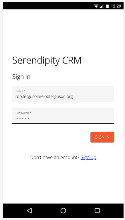
For example, when authenticating mobile users:
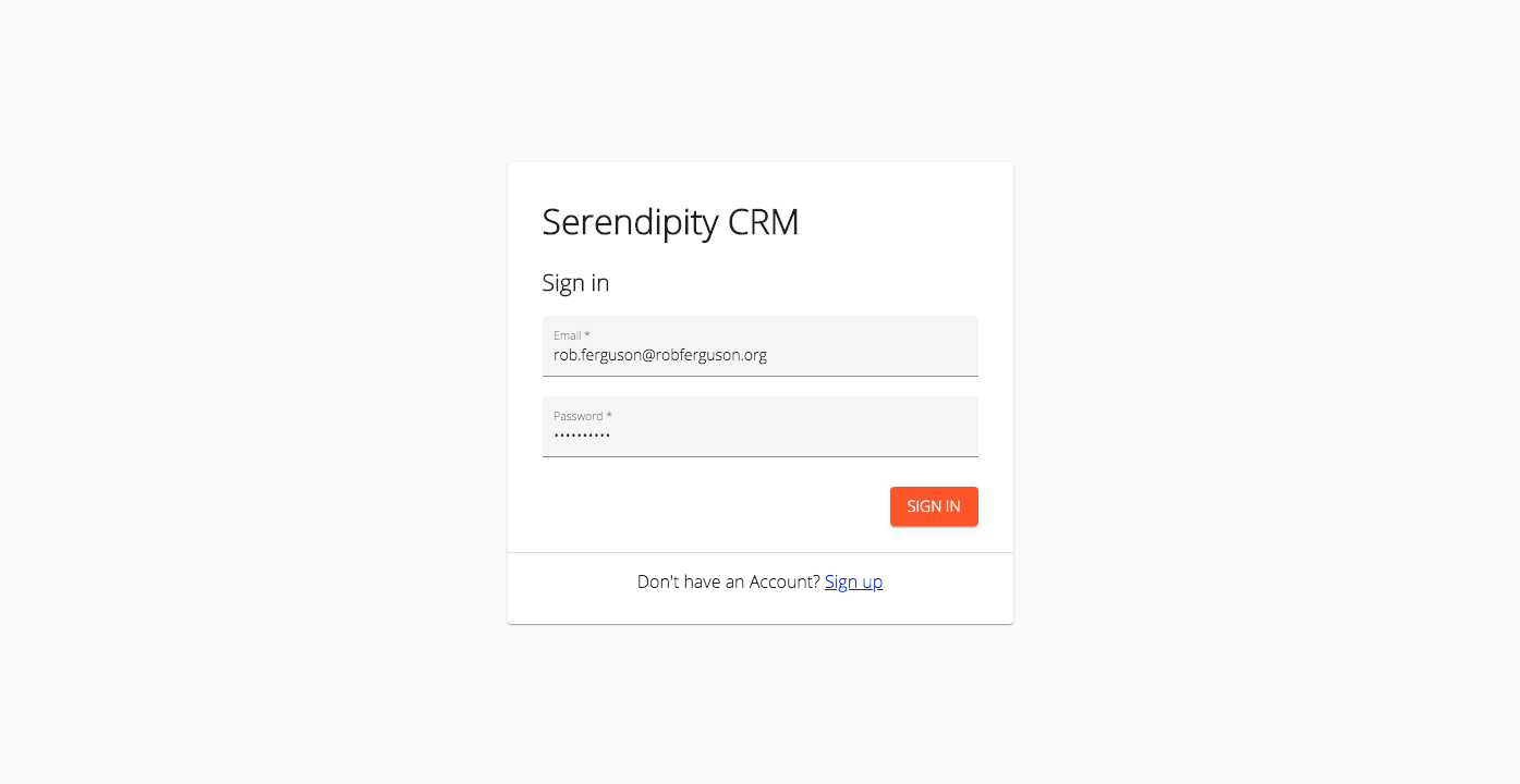
Or desktop users:
Toolbar - Fixed
You can fix a toolbar to the top of your sidenav's content:
.crm-navigation-bar {
  position: fixed;
  top: 0;
  left: 0;
  right: 0;
  z-index: 998;
}
So that content will scroll behind your toolbar:
Sidenav
The App's sidenav is an application-wide, single use component so we will add it to the App's Core module:
ng generate component core/components/nav --module=core/core
I updated the sidenav's template to include a nav list (<mat-nav-list>) and some list items (mat-list-item):
<mat-sidenav-container>
<mat-sidenav #sidenav mode="over">
<mat-toolbar>
<mat-toolbar-row>
<h2> {{ 'APP_TOOLBAR_TITLE' | translate }} </h2>
</mat-toolbar-row>
</mat-toolbar>
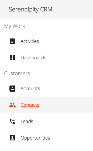
<mat-nav-list>
<h2 matSubheader> {{ 'MY_WORK' | translate }} </h2>
<a *ngFor="let item of myWorkRoutes"
mat-list-item
(click)="sidenav.close()"
[routerLink]="[item.route]"
routerLinkActive="list-item-active">
<mat-icon matListIcon> {{ item.icon }} </mat-icon>
{{item.title}}
</a>
<mat-divider></mat-divider>
...
</mat-nav-list>
</mat-sidenav>
<mat-sidenav-content>
<crm-navigation-bar
*ngIf="isAuthenticated()"
(toggleSidenav)="sidenav.toggle()">
</crm-navigation-bar>
<router-outlet></router-outlet>
</mat-sidenav-content>
</mat-sidenav-container>
I also updated the sidenav's content area to include a Navigation Bar.
Launch the server:
ng serve --open
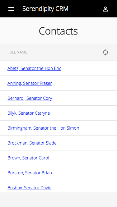
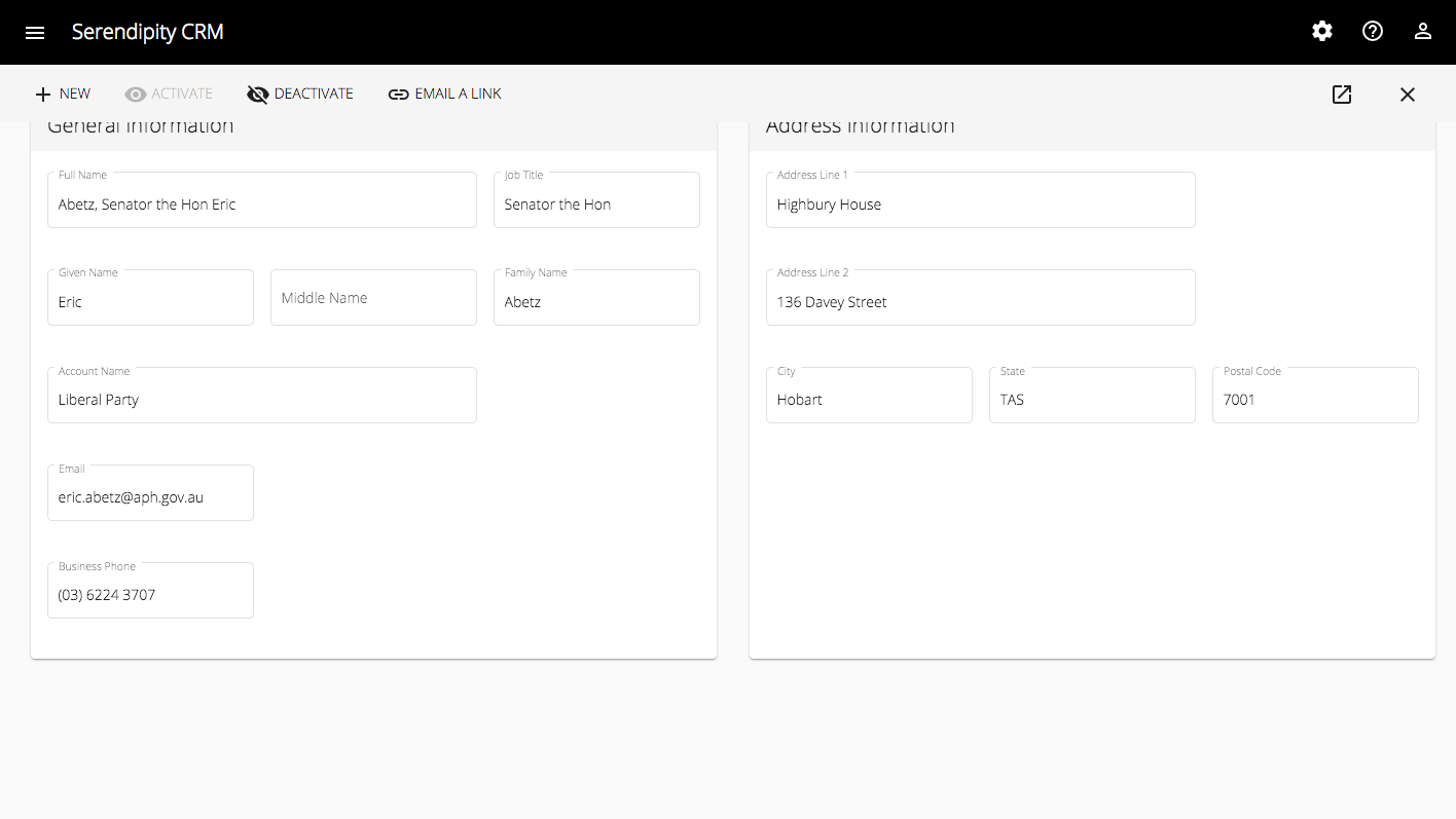
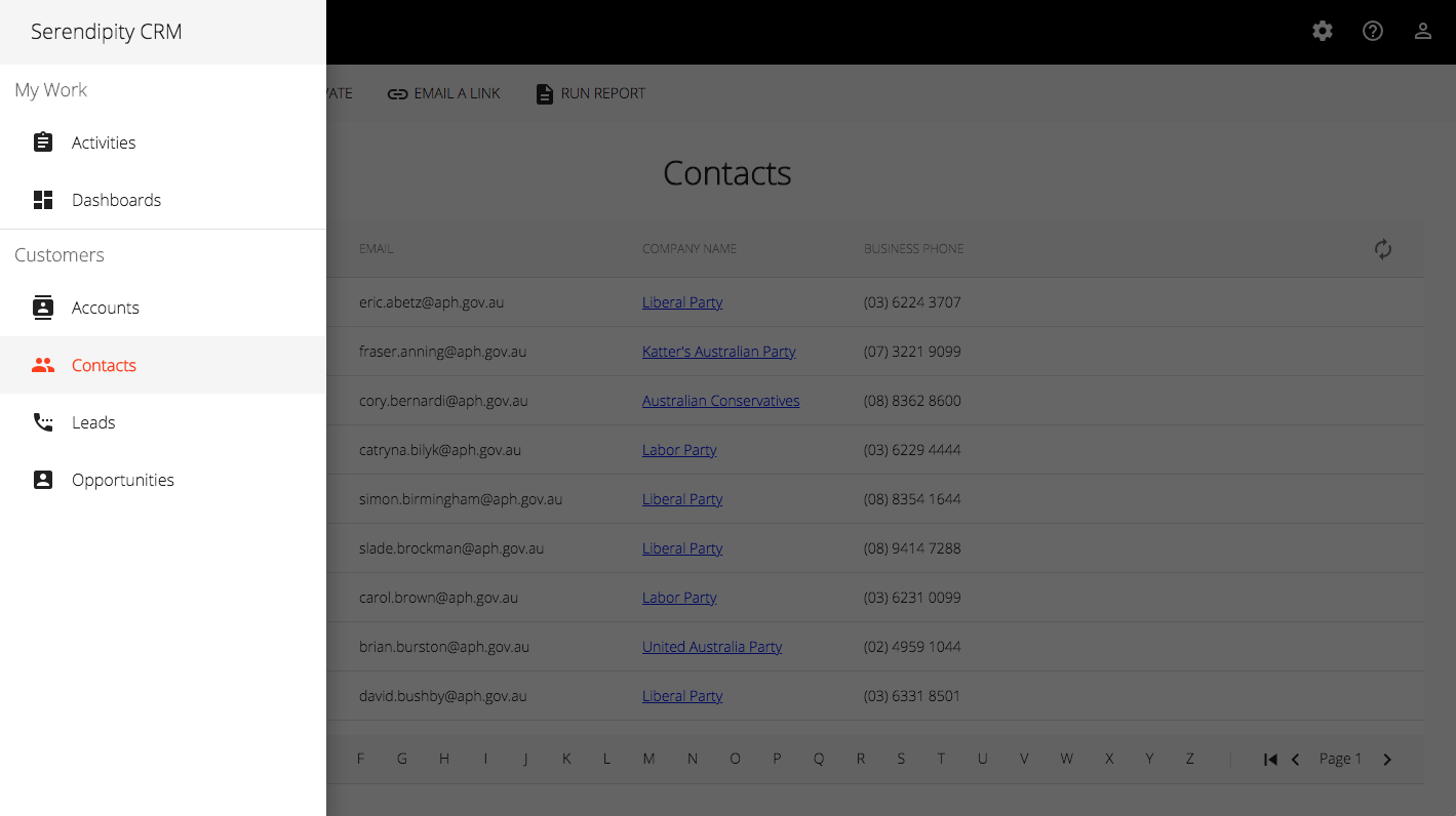
You should see output like:
Sidenav Tips
Sidenav Selection
You can workaround the <mat-nav-list> selection issue (it always highlights the first <mat-list-item>):
By using a zero height <mat-list-item>:
<mat-sidenav-container>

  <mat-sidenav #sidenav mode="over">

    ...

    <mat-nav-list>

      <h2 matSubheader> {{ 'MY_WORK' | translate }} </h2>

      <a mat-list-item routerLink="/" style="height: 0;"></a>

      ...

    </mat-nav-list>

  </mat-sidenav>

</mat-sidenav-container>
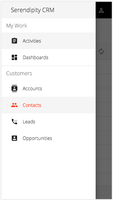
You should see output like:
Note: Some other great sources of sample code are the Angular Material examples and the Teradata UI Platform.
What's Next
In this post, I take a look at Angular Material's table component.
Demo:
- Firebase Hosting: Serendipity
Source Code:
- GitHub: Serendipity
References:
- material.angular.io: Angular Material - Components