
In previous posts, I wrote about Getting started with Angular Material and Angular Material: toolbar and sidenav.
In this post, I take a look at Angular Material's table component.
Layout
The Material Design website includes a great introduction to layout.
Angular Material Starter Components
A great way to learn about Angular Material is to look at sample code, so I used the Angular CLI to generate a starter component that includes a table:
ng generate @angular/material:table my-table
After looking at the @angular/material:table starter component's sample code I decided to create a table component.
Table
Requirements
First and foremost, I wanted my table component to support:
- JSON configuration files
I also wanted my table component to provide:
- A 'sticky' table header
- A 'sticky' table footer with support for filtering and pagination
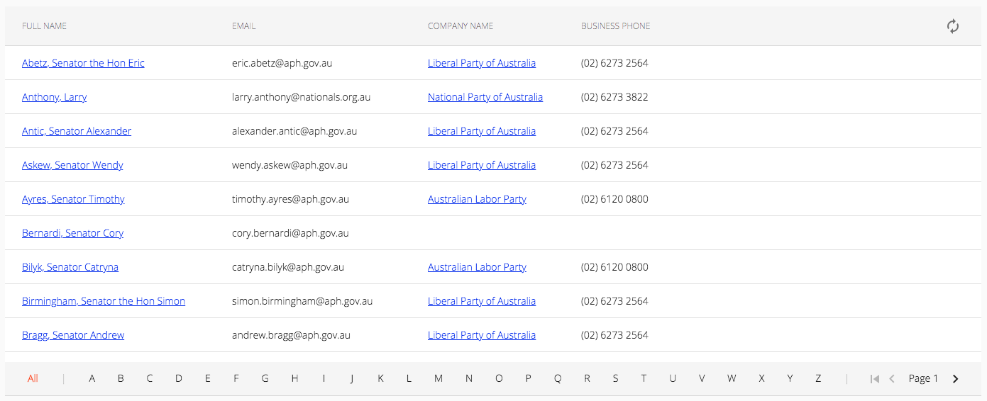
Here's what it looks like:
JSON configuration
I used the Angular CLI to generate the scaffolding for a new service:
ng generate service services/config/config --project=utils
I updated the Config service as follows:
import { Injectable } from '@angular/core';
import { HttpClient } from '@angular/common/http';

@Injectable({
  providedIn: 'root'
})
export class ConfigService {

  private uriPrefix = 'assets/data/config/';
  private uriSuffix = '.json';

  constructor(private httpClient: HttpClient) {}

  public get(filename: string): Promise<any> {
    return this.httpClient.get<any>(this.uriPrefix + filename + this.uriSuffix).toPromise();
  }

}
A sample (column definitions) JSON configuration file:
[

  {
    "name": "party.displayName",
    "displayName": "FULL_NAME",
    "routerLink": "party.id",
    "class": "anchor"
  },
  {
    "name": "email",
    "displayName": "EMAIL",
    "routerLink": "",
    "class": ""
  },
  {
    "name":  "organisation.displayName",
    "displayName": "COMPANY_NAME",
    "routerLink": "organisation.id",
    "class": "anchor"
  },
  {
    "name":  "organisation.phoneNumber",
    "displayName": "BUSINESS_PHONE",
    "routerLink": "",
    "class": ""
  }

]
Table Component
I generated the scaffolding for a new component:
ng generate component components/collection/collection --project=sales
I updated the Collection component as follows:
...

export abstract class CollectionComponent<T> implements OnInit, AfterViewInit, OnDestroy {

  @ViewChild(MatSort, {static: false})
  public sort: MatSort;

  public columnDefs: ColumnDef[];
  public dataSource: MatTableDataSource<T>;
  public displayedColumns: string[];
  public items: Array<T>;

  ...

  constructor(config: CollectionComponentConfig) {

    this.columnDefsFilename = config.columnDefsFilename;
    this.desktopDeviceColumns = config.desktopDeviceColumns;
    this.mobileDeviceColumns = config.mobileDeviceColumns;

    const injector: Injector = StaticInjectorService.getInjector();

    this.configService = injector.get<ConfigService>(ConfigService as Type<ConfigService>);

    ...
  }

  public ngOnInit() {

    this.loadColumnDefs(this.columnDefsFilename).then(() => {
      this.subscribe();
    });

  }

  protected async loadColumnDefs(configFilename: string): Promise<any> {

    this.columnDefs = await this.configService.get(configFilename);

    this.columnDefs.forEach(column => {

      this.translate.get(column.displayName).subscribe(value => {
        column.displayName = value;
      });

    });

  }

  ...

}
The Collection component's constructor accepts a config object containing the name of the column definitions file (columnDefsFilename). The Collection component uses the Config Service to load the column definitions in the ngOnInit() method.
You also need to provide two string arrays, one containing the names of the columns you want to display when the current viewport matches a desktop device and another containing the names of the columns you want to display when the current viewport matches a mobile device, for example:
export const CONTACTS_COLUMNS_DESKTOP = [ 'party.displayName', 'email', 'organisation.displayName', 'organisation.phoneNumber', 'id' ];
export const CONTACTS_COLUMNS_MOBILE  = [ 'party.displayName', 'organisation.phoneNumber', 'id' ];
The Collection component will update the array of displayed columns (displayedColumns) when reacting to viewport changes:
  public ngAfterViewInit() {

    this.breakpointObserver.observe([ Breakpoints.HandsetPortrait ]).subscribe(result => {

      if (result.matches) {
        this.displayedColumns = this.mobileDeviceColumns;
      } else {
        this.displayedColumns = this.desktopDeviceColumns;
      }

      this.footerColSpan = this.displayedColumns.length;
    });

  }
Contacts Component
The Collection component is an abstract class from which other classes may be derived. In order to take advantage of the Collection component, we need to extend it and provide an implementation for any abstract methods.
I used the Angular CLI to generate the scaffolding for a new component:
ng generate component components/contacts/contacts --project=sales
I updated the Contacts component as follows:
...

@Component({
  selector: 'sales-contacts',
  templateUrl: './contacts.component.html',
  styleUrls: ['./contacts.component.scss']
})
export class ContactsComponent extends CollectionComponent<Contact> {

  constructor(private entityAdapter: ContactAdapter,
              private entityService: ContactsService) {

    super({
      columnDefsFilename: CONTACTS_COLUMN_DEFS,
      desktopDeviceColumns: CONTACTS_COLUMNS_DESKTOP,
      mobileDeviceColumns: CONTACTS_COLUMNS_MOBILE
    });

  }

  protected subscribe() {

    this.subscription = this.entityService.find(this.offset, this.limit, this.filter).subscribe(

      (response: any) => {

        this.count = response.body.meta.count;
        this.items = response.body.data.map((item => this.entityAdapter.adapt(item)));

        this.dataSource = new MatTableDataSource(this.items);
        this.dataSource.data = this.items;
        this.dataSource.sortingDataAccessor = pathDataAccessor;
        this.dataSource.sort = this.sort;

      }

      ...

    );

  }

}
I updated the Contacts component's template as follows:
<crm-command-bar>

  <button mat-button class="crm-command-bar-button" (click)="onNew()">
    <mat-icon>add</mat-icon>
    {{ 'NEW' | translate }}
  </button>

  ...

</crm-command-bar>

<div class="crm-component-title-container">
  <h1 class="crm-component-title"> {{ 'CONTACTS_HEADER' | translate }} </h1>
</div>

<div class="crm-content-container">

  <ng-container *ngIf="!items; then skeleton"> </ng-container>

  <div class="crm-table-container">

    <ng-container *ngIf="columnDefs">

      <table mat-table
             [hidden]="!items"
             [dataSource]="dataSource"
             matSort
             matSortStart="desc"
             matSortDisableClear
             class="mat-elevation-z8 crm-table">

        <ng-container *ngFor="let column of columnDefs" [matColumnDef]="column.name">

          <th mat-header-cell *matHeaderCellDef mat-sort-header>
            {{ column.displayName }}
          </th>

          <td mat-cell *matCellDef="let row">

            <!-- See: .scss for mat-column styles -->

            <ng-container *ngIf="!column.routerLink; else link">
              {{ getProperty(row, column.name) }}
            </ng-container>

            <ng-template #link>
              <a *ngIf="column.name === 'party.displayName'"
                 [routerLink]="[getProperty(row, column.routerLink)]">
                {{ getProperty(row, column.name) }}
              </a>
              <a *ngIf="column.name === 'organisation.displayName'"
                 [routerLink]="['/sales/accounts', getProperty(row, column.routerLink)]">
                {{ getProperty(row, column.name) }}
              </a>
            </ng-template>

          </td>

        </ng-container>

        <!-- ID column (padding column RTL) -->

        <ng-container matColumnDef="id">
          <th mat-header-cell *matHeaderCellDef class="header-cell-id">
            <button mat-icon-button>
              <mat-icon matListIcon class="header-icon">autorenew</mat-icon>
            </button>
          </th>
          <td mat-cell *matCellDef="let element"> </td>
          <td mat-footer-cell *matFooterCellDef> </td>
        </ng-container>

        <!-- Footer -->

        <ng-container matColumnDef="footer">
          <td mat-footer-cell *matFooterCellDef [attr.colspan]="footerColSpan">
            <sales-collection-footer [host]="this">
            </sales-collection-footer>
          </td>
        </ng-container>

        <tr mat-header-row *matHeaderRowDef="displayedColumns; sticky: true"></tr>
        <tr mat-row *matRowDef="let row; columns: displayedColumns;"></tr>
        <tr mat-footer-row *matFooterRowDef="['footer']; sticky: true"></tr>

      </table>

    </ng-container>

  </div>

  <!-- Skeleton template -->

  <ng-template #skeleton>

    <div class="crm-spinner-container">
      <mat-spinner color="accent"></mat-spinner>
    </div>

  </ng-template>

</div>
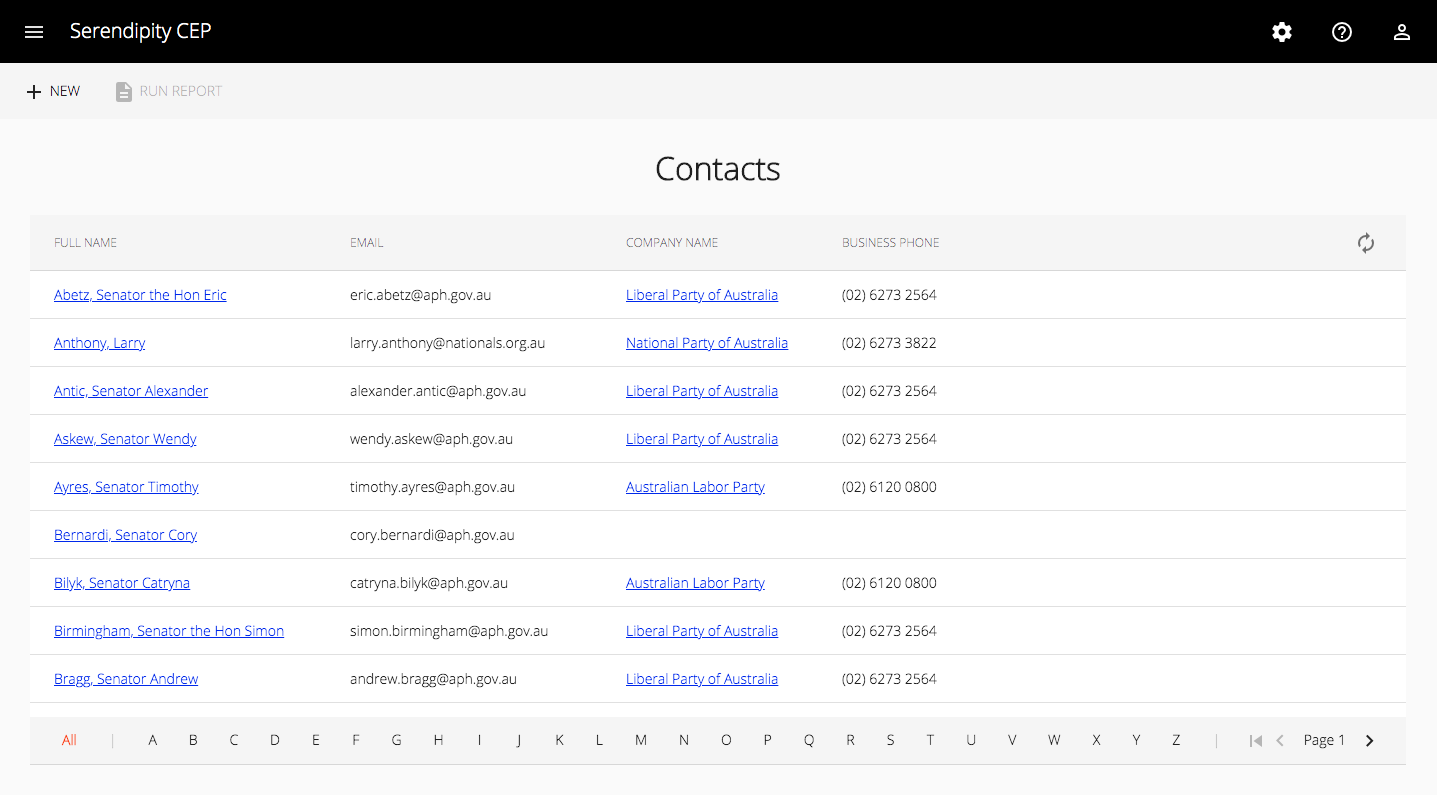
Here's what it looks like:
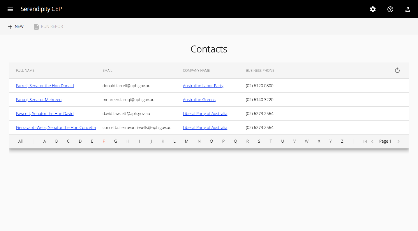
Here's what it looks like, when filtered:
Source Code:
- GitHub: Serendipity - The open source Customer Engagement Platform
- GitHub: The REST API for the Serendipity Customer Engagement Platform
References:
- material.angular.io: Table Component
- Angular Components: Support multi-level density for all components